In early 2022, WorldVue (then World Cinema) made the decision to undergo a full scale rebrand, including a name change. The legacy of the World Cinema name goes back to 1974, when the company was founded, but changes in core technology and product offerings over the years meant that the ‘Cinema’ in World Cinema was contributing a significant amount of confusion to potential customers. This, coupled with a series of acquisitions, meant it was time to do something new. We spent nearly a year brainstorming, exploring, and vetting potential new names – everything was on the table. Eventually, it was decided to move forward with WorldVue, a name which felt modern and new while also maintaining a connection to the past. Fast forward to October of 2023, and we launched the rebrand and a completely redeisgned website.
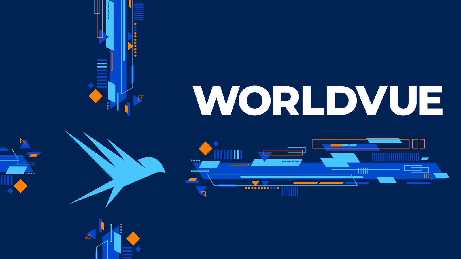
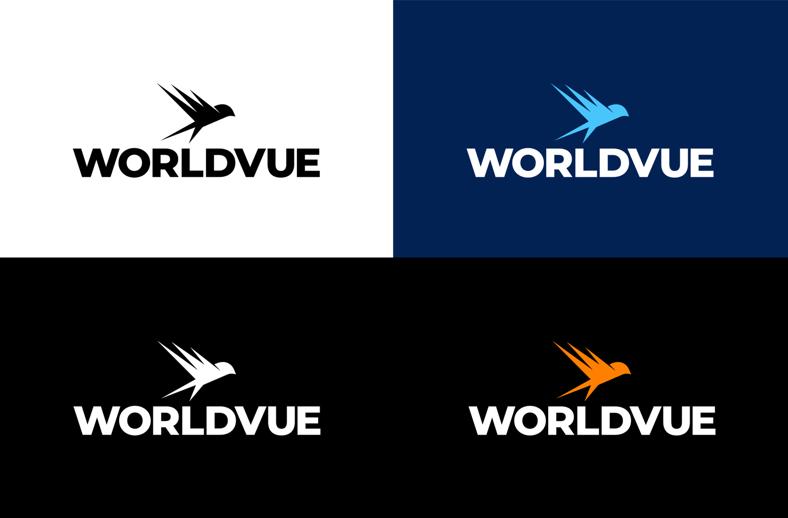
When approaching a logo for a technology company that was actively seeking to branch into new verticals and markets, it was difficult to conceive of a logo or an icon that appropriately encompassed everything. Rather than fall back on ‘easy’ options like a globe, we decided to move forward with something that encompassed the company’s internal ideals. For the last several years, WorldVue had been cultivating an internal culture based on the concept of CHIRP, which is to mean that all employees should strive to be Coachable, Humble, Intelligent, Responsive, and Persistent.
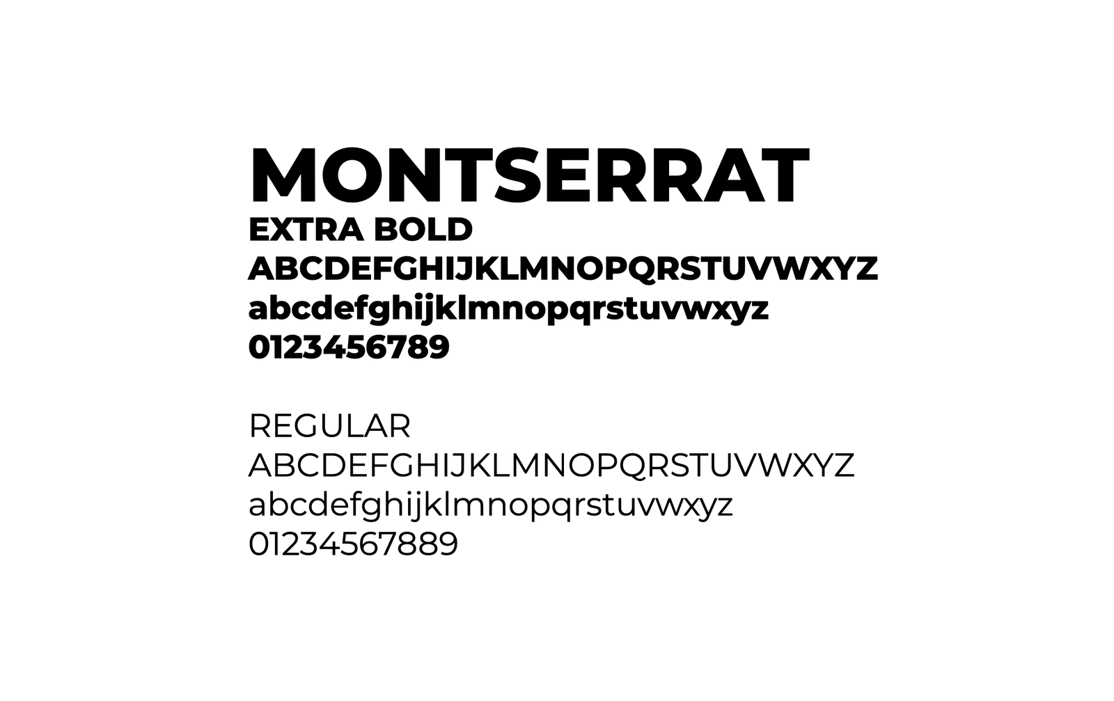
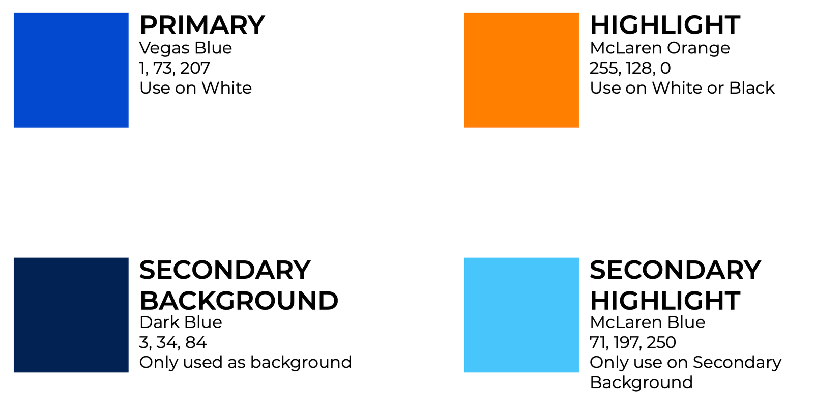
When it came to choose a typeface, the directive was clear – go bold. Big, chunky letters, but also ideally something that included a great body copy font. Montserrat was an easy go-to. It also had ties back to the legacy branding as well, as we had used Montserrat for various product brands in the past. The colors, while new, also maintained a similar feel to the original brand, though we expanded the palette a bit to enable more flexibility for times whent eh bright blue and orange don’t quite work.
WorldVue is a company with a variety or branded products and programs, so part of the job was to make sure we brought each of those pieces forward as well. This allowed us a bit more flexibility and fun with the brand, creating some additional iconography and using the colors in new ways.