Houston Viola Society is a non-profit organization in Houston, TX that strives to raise awareness and promote education related to the Viola. They host events, give performances, and look for new ways to promote their instrument of choice. In order to reengage their audience, and some of their board members, they decided it was time for a new visual brand and website, which is where I stepped in. They launched their new branding and website in mid 2020.
The name Houston Viola Society was a mouthful from day one, and it was only natural that everyone fell back to using the initials HVS. With the new branding, they wanted to lean into that to create a geometric icon that felt modern and expressive. The hope was that realizing that the series of blocks and shapes were actually only there occupying the negative space between the letters, which were left transparent, created something for the eye to discover, with the hopes that the act of discovery itself was memorable.
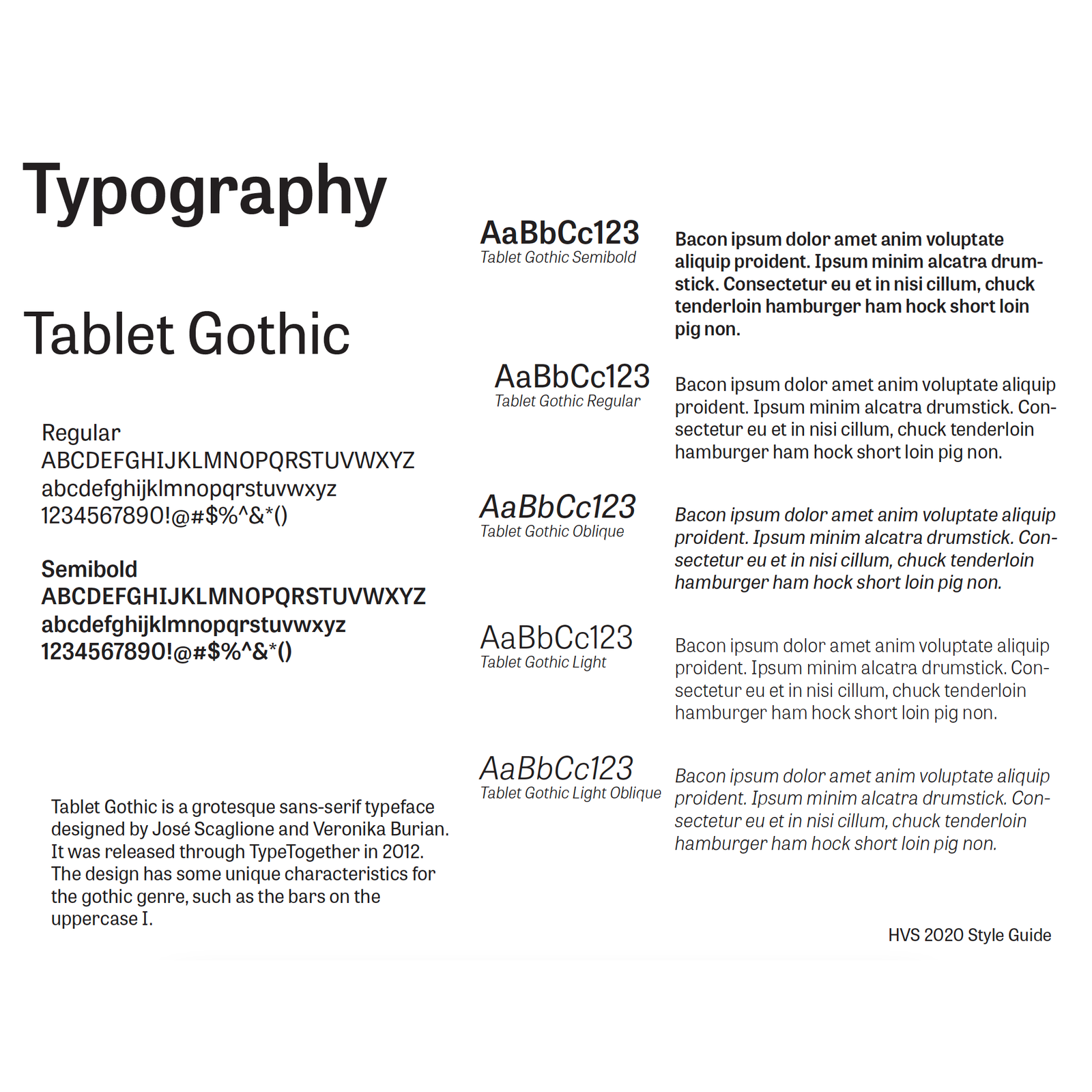
Tablet Gothic felt like a great choice for this brand, both in how it functions for their word mark but also because it was inherently useful as their body copy font as well. Paired with a series of bold color choices with ties to the organization’s past and we were well on our way.